|
A simple example
When you activate physica
a welcome message followed by the first PHYSICA:
prompt is printed in the text window, and another window pops up, the
one in which physica will display the graphics. Only one window
can be active at any given time, so you may need to move the mouse
inside the window that you want to ``connect'' your keyboard to. You may
want to resize and/or move the text window around so that you can see
both at the same time. Do not resize or close the graphics output
window; it will get closed automatically when you exit physica.
Let's assume you have started physica successfully. At PHYSICA: prompt type the following:
x=[1:8]
y=[0.05;0.10;0.14;0.19;0.25;0.30;0.34;0.40]
graph x,y
Your graphics window should be showing the graph of y vs. x!
(You can jump ahead and take a peek at Figure 1
if you are not running physica, typing these commands as you go along).
The above data could have been something like time and
distance from one of your air track experiments. In fact, we should
have also entered the error bars at each data point, like this:
dy=[0.02;0.07;0.01;0.04;0.05;0.10;0.02;0.04]
clear
graph x,y,dy
We have used clear to clear the graph and start a new one with
the next graph command.
You can immediately see that the dependence is roughly linear. Let us
investigate closer. First of all, the line connecting the points is
really inappropriate, since we only made a discrete set of measurements
and really know nothing about what y(x) is like in between our
data points. To fix that, we will change one of the settings of
physica, that of the plotting character,
or pchar.
set pchar -10
clear
graph x,y,dy
Now each data point is indicated by a triangle (the plotting character
No. 10), and there is no line connecting the data points (the minus sign in
front of 10).
Now we are free to use a line to indicate a theoretical model that fits
this data. From the way we generated our data (air track) we expect a
linear dependence. Let's fit the data to a linear expression:
scalar\vary a
fit y=a*x
The output generated by physica, among other things, tells us
that the best value for the parameter a is 0.0493+/-0.0038.
The error in the fit is given by the standard deviation (the E2
parameter), and there are some other useful numbers reported which we
will ignore for now.
Armed with this best fit, we can add a ``theoretical'' line to our
experimental plot. We can recalculate what the values should have been
if the experiment yielded exactly the linear dependence we expect, by
``updating'' a new vector, f, to contain the values that the
last fit command had calculated:
fit\update f
set pchar 0
graph\noaxes x,f
Two points of interest here: we used set pchar 0 to turn the plotting
character to none and the line through the points to on, and then we
used a switch (\noaxes) on the graph command to add the
second graph to the already existing one. Looks pretty cool.
To add the final touches, let's label things properly:
label\xaxis `Time, s'
label\yaxis `Distance, m'
graph\axes x,f
replot
Figure 1 shows what your plot should look like at this point.
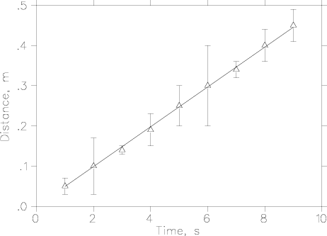
Figure 1. A simple example. Plotting data points with error bars.
The fit to a linear equation is shown as a solid line.
Encapsulated PostScript (.eps) file
Before we advance on to more elaborate things you must learn how to end
your physica session. The magic word is
quit
Try it now.
One remark: your graph may look slightly different. In creating
Figure 1 I had doubled the size of the plotting
character to 2% of the page width, up from the default 1%, using the
command:
set %charsz 2
before the graph command. It's one of those slightly more
advanced commands that we will get to soon.
Up: Table of contents
Next: Reading data into physica
Previous: Hardware
|